A couple more notes…
Regarding “body hair”, that’s likely going to be a slider. At least, it’s that way in the base model where you can use a slider to make it disappear. SO I’m expecting that to remain similar in the drow version too.
For the rest, again it’s important to understand that it’s applied to the same base model in all three cases. So if you find one more realistic because of “endowment” then that’s due to how the sliders are set.
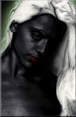
Just purely look at the skin texture.
I agree that in B the breasts seem to be stuck on, which is probably due to the texture. There seem to be highlights under the breasts that make them look like this. Though maybe that’s through some kind of material setting.
It’s interesting to see that the consensus in the discussion seems to lean towards A, where the poll seems to lean towards B. Hmmmm.
Love -x-x-x-
Shir'le
Drow skin textures (nudity inside)
Moderators: Shir'le E. Illios, Bhaern Quel
-
Shir'le E. Illios
- High Priestess

- Posts: 2352
- Joined: Mon Feb 13, 2006 9:51 pm
- Location: Eilistraee.com
- Contact:
-= Shir'le E. Illios =-
Chosen of Eilistraee
-
Qhell~Velladorn
- Regular
- Posts: 368
- Joined: Mon Apr 24, 2006 4:45 am
- Location: Bedford, Ky. United States
- Contact:
Drow skin textures
[color=teal:308u58f7]Of all the pics, including the altered A2 and B2, I would have to go with A2. It seems to me the most realistic of all(including the body hair)and seems to fit the biggest part of the descriptions given in most of the books I've read on them, from Cunningham to Salvatore and in between.[/color:308u58f7]
Eilistraees' jusron kus trelao waer'honglath pholor verin areion ussta velven.
-
Shir'le E. Illios
- High Priestess
- Posts: 2352
- Joined: Mon Feb 13, 2006 9:51 pm
- Location: Eilistraee.com
- Contact:
Did some more editing on A2. Added a very slight amount of blue colorization and did a slight amount of brightness and contrast increase (increasing contrast makes it slightly darker so had to increase brightness a bit as well).
This is the result, compared to the first two:
[center:36xdhib2][img:36xdhib2]http://www.eilistraee.com/a/drowA1.jpg[/img:36xdhib2] [img:36xdhib2]http://www.eilistraee.com/a/drowA2.jpg[/img:36xdhib2] [img:36xdhib2]http://www.eilistraee.com/a/drowA3.jpg[/img:36xdhib2][/center:36xdhib2]
I must say, I really like how that turned out. Is almost exactly the same as the skintone for my avatar now (which I really like if I say so myself ). Now I wonder if I can get that same effect by editing the texture or if I’ll have to do some post-processing to get that effect.
What do you think? Did I improve it or did I just make it worse?
Love -x-x-x-
Shir'le
This is the result, compared to the first two:
[center:36xdhib2][img:36xdhib2]http://www.eilistraee.com/a/drowA1.jpg[/img:36xdhib2] [img:36xdhib2]http://www.eilistraee.com/a/drowA2.jpg[/img:36xdhib2] [img:36xdhib2]http://www.eilistraee.com/a/drowA3.jpg[/img:36xdhib2][/center:36xdhib2]
I must say, I really like how that turned out. Is almost exactly the same as the skintone for my avatar now (which I really like if I say so myself
What do you think? Did I improve it or did I just make it worse?
Love -x-x-x-
Shir'le
-= Shir'le E. Illios =-
Chosen of Eilistraee
well...
Well, the best one was A3, but, as it's beem said before, it's particulare with every drow. (Resaults may vary.) But I suppose the best one was A3. Well, in light of course. I suppose it doesn't make any difference, when you see only wormth of the body. But to normal eyesight, A3 rules.

B, hands down. Though A has her uses, so I won't discount her as an option for other Drow concepts.
Note I am not judging based on her blasted tits, just skin texture as per the 'polished obsidian' standard that looks so beautiful.
Note I am not judging based on her blasted tits, just skin texture as per the 'polished obsidian' standard that looks so beautiful.
It is difficult for others to truly speak their heart or listen to it. The words often prove difficult, or they do not come at all - Brianna
-
Qhell~Velladorn
- Regular
- Posts: 368
- Joined: Mon Apr 24, 2006 4:45 am
- Location: Bedford, Ky. United States
- Contact:
Drow skin textures
[color=teal:w31u8wxu]A3 is a definate shoe in for me, and not becuase of what Jubilee said about basing things on tits either. The skin tone kinda brings to mind a certain young Baenre female by the name of Liriel, at least that's how I think of her, not the glossy skinned elf on the book covers.[/color:w31u8wxu]
Eilistraees' jusron kus trelao waer'honglath pholor verin areion ussta velven.
-
Bhaern Quel
- Demigod
- Posts: 2106
- Joined: Tue Feb 14, 2006 10:32 pm
-
Ssin'urn Streea
- Regular
- Posts: 345
- Joined: Wed Feb 15, 2006 4:41 pm
- Location: Your Worst Nightmare
[font=garamond:o5cv8j5p][b:o5cv8j5p][i:o5cv8j5p][color=indigo:o5cv8j5p]Maybe you could start another poll based on the remaining pics. I also agree, A3 all the way!! [/color:o5cv8j5p] [/size:o5cv8j5p][/i:o5cv8j5p][/b:o5cv8j5p][/font:o5cv8j5p]
~Don't close your Eyes~
Dos zhahen rosin bri wun vlos lu sca varn, orior ulu el nindel i dol!

Dos zhahen rosin bri wun vlos lu sca varn, orior ulu el nindel i dol!
-
Ssin'urn Streea
- Regular
- Posts: 345
- Joined: Wed Feb 15, 2006 4:41 pm
- Location: Your Worst Nightmare
All of the A variations look as good as one another. Honestly I tend to prefer to think of drow as having a slight blue/purple tint as in A3 but as they can have the tones of any of the three I think they are all good.
I voted on both A and C before, and I'd stick with that vote so I don't see the need for another poll, of course I'll vote again if another poll is made.
I voted on both A and C before, and I'd stick with that vote so I don't see the need for another poll, of course I'll vote again if another poll is made.
-
Shir'le E. Illios
- High Priestess
- Posts: 2352
- Joined: Mon Feb 13, 2006 9:51 pm
- Location: Eilistraee.com
- Contact:
Locked the topic because I started [url=viewtopic.php?p=3211:1eo2zugh]a new one[/url:1eo2zugh].
Love -x-x-x-
Shir'le
Love -x-x-x-
Shir'le
-= Shir'le E. Illios =-
Chosen of Eilistraee