Drow skin texture part 2 (more nudity inside)

This forum is for general discussion and open to all. If there is anything you wish to talk about with the Chosen then this is the place to do it. Please limit the use of this forum to out of character discussions. For in character roleplaying please use the Free Form Roleplaying forum.

Moderators: Shir'le E. Illios, Bhaern Quel

Which of these drow skin textures looks better?

The skin in image A looks best
0
No votes
The skin in image B looks best
15
83%
They both look equally good
2
11%
They both look equally bad
1
6%
 
Total votes: 18

User avatar
Shir'le E. Illios
High Priestess
High Priestess
Posts: 2352
Joined: Mon Feb 13, 2006 9:51 pm
Location: Eilistraee.com
Contact:

Drow skin texture part 2 (more nudity inside)

Post by Shir'le E. Illios »

As in the [url=viewtopic.php?p=3165:5tyoul46]previous thread[/url:5tyoul46] I’m interested in your thoughts on which drow skin texture looks better.

Only this is slightly different in that I bought the top two choices from the previous thread (was only $16 or so) and have been playing with Poser using them. I modified one of the base textures (for choice A) and then tried both versions on the same model.

So the question is, which of these is better:

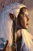
[center:5tyoul46][img:5tyoul46]http://www.eilistraee.com/a/DrowPoserA.jpg[/img:5tyoul46]

[img:5tyoul46]http://www.eilistraee.com/a/DrowPoserB.jpg[/img:5tyoul46][/center:5tyoul46]

The model in both is exactly the same, so no more people falling over breast sizes and body hair and such. In fact, the only difference between the two is that in B the lights are [i:5tyoul46]darker[/i:5tyoul46] (yes, darker).

As you can see A is very dark. So black that is nearly disappears against the background. In B the features are a lot more distinguishable, but the skin also looks more ashen grey than black.

Obviously I can modify the textures more, but I’m curious to hear what you think of them. :)


Love -x-x-x-

Shir'le
F'sarn natha tithaur wun l'su'aco.

-= Shir'le E. Illios =-
Chosen of Eilistraee
Tyrmer
Hero||Heroine
Posts: 1037
Joined: Thu Feb 16, 2006 5:52 pm
Location: Newcastle (United Kingdom)

Post by Tyrmer »

No offense but I don;t actually particularly like either of them. :S

B looks more like a half drow to me and A just doesnt look so realistic (even for a fantasy species) as it looks a little gravely. Of the two I would say that B is the better though.

Sorry if this seems overly critical (hey I know I couldn't do any better).
Titles:

Master of the Lady's Dances
Recoverer of the Tome of Moonlight
Scribe of the Dark Maiden's Temple

High Priest of the Church of Rooky :D
User avatar
Qhell~Velladorn
Regular
Posts: 368
Joined: Mon Apr 24, 2006 4:45 am
Location: Bedford, Ky. United States
Contact:

Drow skin textures 2

Post by Qhell~Velladorn »

[color=teal:3fw3xgwv]I think I'm gonna have to agree with Tyrmer on this one Great Lady. Neither of them quite have what any of the others in the other thread had, yet if I truly had to decide on one in here and none in there, I'd pick A. For some reason that one seems to represent the darler side of the drow, while the A pictures in the other thread represent the lighter side, such as us that post here.[/color:3fw3xgwv]
Eilistraees' jusron kus trelao waer'honglath pholor verin areion ussta velven.
Ssin'urn Streea
Regular
Posts: 345
Joined: Wed Feb 15, 2006 4:41 pm
Location: Your Worst Nightmare

*EDITS*

Post by Ssin'urn Streea »

[color=indigo:3sd6nurl]If I may be so bold as to speak plainly...


I think Shir'le chose this particular model so she could narrow the discussion of opinion to [i:3sd6nurl]just[/i:3sd6nurl] the [i:3sd6nurl]skin tone[/i:3sd6nurl]. ;) I think A is exactly the right shade of skin pigment for a drow at long distance but B is good for up close. Perhaps a better blending of A might help. B appears to be shiny but I think it is merely the lighting.

In essence, this time I'll go for B.[/color:3sd6nurl]
Last edited by Ssin'urn Streea on Mon Jun 26, 2006 6:58 am, edited 1 time in total.
~Don't close your Eyes~

Dos zhahen rosin bri wun vlos lu sca varn, orior ulu el nindel i dol!
Image
Nedylene
Hero||Heroine
Posts: 1028
Joined: Sat Apr 22, 2006 4:42 pm
Location: Richmond Virginia

Post by Nedylene »

I have to admit I liked B again...I have also always been of the opinion that with such dark skin many of the more vain drow characters probably use a lot of skin oils because I know from my own experience that dark skin has a tendency to look ashy if you don't, so any shinyness could be counted off to it being a vain drow...lol...
User avatar
Shir'le E. Illios
High Priestess
High Priestess
Posts: 2352
Joined: Mon Feb 13, 2006 9:51 pm
Location: Eilistraee.com
Contact:

Post by Shir'le E. Illios »

Bah, I’m obsessed.

I must admit that I had some trouble with both of them as well, and spent all night thinking of what I could’ve done wrong. I thought perhaps it was the lighting, so this morning (before going to work and thus coming in a bit late... as I said I’m obsessed with this) played around with the light a little.

For A I tried increasing the light intensity to max and even added in another (spot) light. But it didn’t seem to make much of a noticeable difference. I also changed the light for B, disabling all but one light and making that light [i:lerfy7ph]very[/i:lerfy7ph] dark. That one did make a difference as you can see:

[center:lerfy7ph][img:lerfy7ph]http://www.eilistraee.com/a/DrowPoserB2.jpg[/img:lerfy7ph][/center:lerfy7ph]

I actually quite like how that turned out… but the question is how those light conditions are going to work with everything else in the scene. After all, I don’t want to keep her bald and naked the rest of her life; got to have her have some hair and hold a sword at some point. Maybe even a necklace or something. ;)

So what I’m probably going to try when I get home tonight is lighten the texture for A a bit (so that light’ll have more of an influence on it) and try out some combinations with hair and items and clothes and such. Picked up a couple of transparent, white nightgowns somewhere that I’ll hope will give a nice effect with the black skin.

Anyway, with perseverance and your continued comments and suggestions I’m sure I’ll make the perfect drow yet. ;)


Love -x-x-x-

Shir'le
F'sarn natha tithaur wun l'su'aco.

-= Shir'le E. Illios =-
Chosen of Eilistraee
jameslt0
Maid
Maid
Posts: 54
Joined: Fri Jun 02, 2006 1:19 pm
Contact:

Post by jameslt0 »

I think B2 looks the best.

Dy'nereyn
User avatar
Zakharra
Maid
Maid
Posts: 80
Joined: Fri Feb 17, 2006 3:41 pm

Post by Zakharra »

I think both look good, but B2 is the best. B1 is evil, B2 is more good, and the modified B2 is awesome, just touch up her hair a bit. Not so grey and more white.
Rooky
Legend
Posts: 1607
Joined: Wed Feb 15, 2006 11:34 am
Location: A spooky wood, with man-eating little giant space hampsters
Contact:

Post by Rooky »

Giving a quick look (since I just woke up, and I have no will to do anything furhter) I must say that A looks best because it very closely mathces the skin of dark elves.

I don't like B2 very much because it looks like somebody turned off the lights in the room.

B's face looks good, but everything else...She's just a bit sparkly....

Sorry for the hars speech, but at least I didn't shoot you with my doc martens...As my poor father found out this morning...
:3
Jubilee
Maid
Maid
Posts: 119
Joined: Sat Apr 22, 2006 5:29 pm
Location: Iraq
Contact:

Post by Jubilee »

Like before, same thing I said, same thing canon says, polished obsidian. Not oiled obsidian, not sparkled obsidian, not magical obsidian, not vain obsidian, polished.

So on that note, B is quite a nice balance between being able to see, and believe the skin tone, and come close to what it should be.
It is difficult for others to truly speak their heart or listen to it. The words often prove difficult, or they do not come at all - Brianna
User avatar
Shir'le E. Illios
High Priestess
High Priestess
Posts: 2352
Joined: Mon Feb 13, 2006 9:51 pm
Location: Eilistraee.com
Contact:

Post by Shir'le E. Illios »

I feel like I’m finally starting to get the hang of this skin thing. I took some of the material properties for the second texture and used it on the first one. I also lightened the first texture a bit. Then I started some tests.

I found that by playing with the highlight size for the material I have some pretty decent control over how light the skin seems. And now I’d like your opinion on which value looks best. :)

Note that I’ve only change the face texture here… so ignore the scalp and neck and shoulders and such as they’re still the old texture (well, old material properties anyway).

[center:gmcxwmz3][img:gmcxwmz3]http://www.eilistraee.com/a/drowH025.jpg[/img:gmcxwmz3] [img:gmcxwmz3]http://www.eilistraee.com/a/drowH050.jpg[/img:gmcxwmz3]

[img:gmcxwmz3]http://www.eilistraee.com/a/drowH075.jpg[/img:gmcxwmz3] [img:gmcxwmz3]http://www.eilistraee.com/a/drowH100.jpg[/img:gmcxwmz3][/center:gmcxwmz3]

Personally I think I like 75%, the other two seem slightly too dark or too light. But it’s probably a matter of personal taste.


Love -x-x-x-

Shir'le
F'sarn natha tithaur wun l'su'aco.

-= Shir'le E. Illios =-
Chosen of Eilistraee
User avatar
Zakharra
Maid
Maid
Posts: 80
Joined: Fri Feb 17, 2006 3:41 pm

Post by Zakharra »

They all look good. Personally I like the 25% one. I love the dark polished look.. Evil/good and as always.. SEXY! :p
Rooky
Legend
Posts: 1607
Joined: Wed Feb 15, 2006 11:34 am
Location: A spooky wood, with man-eating little giant space hampsters
Contact:

Post by Rooky »

50% and 75% look best to me.

BTW, I forgot to mention, my brother found a topic on the wizards forum: "Drow and is theyre skin really black"

I'll provide a link shortly...
:3
Ssin'urn Streea
Regular
Posts: 345
Joined: Wed Feb 15, 2006 4:41 pm
Location: Your Worst Nightmare

Post by Ssin'urn Streea »

[center:1a4oz2hd][img:1a4oz2hd]http://www.eilistraee.com/a/DrowPoserB2.jpg[/img:1a4oz2hd][/center:1a4oz2hd]

[font=garamond:1a4oz2hd][b:1a4oz2hd][i:1a4oz2hd][color=indigo:1a4oz2hd]OMG Yes!! B2 is absolutely perfect!!!! :))


Note: Needs work on hair structure and eye color. Otherwise I think you have it just right!![/color:1a4oz2hd][/i:1a4oz2hd][/b:1a4oz2hd] [/size:1a4oz2hd][/font:1a4oz2hd]

;)
~Don't close your Eyes~

Dos zhahen rosin bri wun vlos lu sca varn, orior ulu el nindel i dol!
Image
Ameng Le'tener
Maid
Maid
Posts: 7
Joined: Sun Jun 25, 2006 9:25 pm

Post by Ameng Le'tener »

[color=orange:732x0v1g]I like B1, defiantly a much nicer texture and coloring the A. But B2 just seems a bit dark to me. But personally I prefer the texture at 50% as it has a nice dark and glossy look to it, but not too dark or too light. Very nice renders too.[/color:732x0v1g]
Post Reply